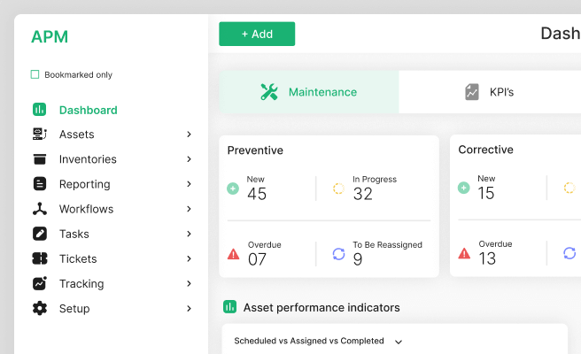
Data Visualization
<p>Data visualization is the representation of data or information in a graphical format. It leverages visual elements like charts, graphs, and maps to enable viewers to understand complex data sets and identify patterns, trends, and insights. This process is crucial for making data-driven decisions, particularly in industries where clear communication of data is essential. For instance, climate tech companies use data visualization to track carbon emissions, monitor climate change impacts, and present findings to stakeholders.</p>
<p>Historically, data visualization has evolved from static charts and graphs to interactive and dynamic dashboards, enhancing user interaction and exploration. Modern tools like Tableau, Power BI, and D3.js have revolutionized how data is visualized, making it more accessible and insightful for users across various sectors.</p>
<h2 id="2">Importance of Data Visualization</h2>
<p>Data visualization is not merely about making data look attractive but about making it more understandable and actionable. It plays a pivotal role in:</p>
<ul>
<li>Identifying trends and patterns that might not be evident in raw data.</li>
<li>Communicating data insights effectively to stakeholders.</li>
<li>Facilitating quicker decision-making by presenting data in a clear and concise manner.</li>
<li>Enhancing the ability to analyze large datasets through visual summaries.</li>
</ul>
<p>For example, in climate tech, data visualization can help illustrate the impact of various carbon reduction strategies over time, enabling organizations to make informed decisions about their sustainability initiatives.</p>
<h3 id="3">Components of Effective Data Visualization</h3>
<p>Several elements contribute to the effectiveness of data visualization:</p>
<p><strong>Clarity:</strong> The visual should present data in a clear and straightforward manner, avoiding unnecessary complexity that can obscure the message.</p>
<p><strong>Accuracy:</strong> Data must be represented accurately to maintain credibility and ensure the insights derived are valid.</p>
<p><strong>Relevance:</strong> The visualization should focus on the most relevant data points that address the user's needs or questions.</p>
<p><strong>Interactivity:</strong> Interactive elements can enhance user engagement and allow deeper exploration of the data. Tools like <a href="https://www.tableau.com/" style="color: blue; text-decoration: underline;">Tableau</a> and <a href="https://powerbi.microsoft.com/" style="color: blue; text-decoration: underline;">Power BI</a> offer robust interactivity features.</p>
<h3 id="4">Types of Data Visualization</h3>
<p>There are numerous types of data visualization, each suited to different kinds of data and insights:</p>
<p><strong>Bar Charts:</strong> Useful for comparing quantities across different categories.</p>
<p><strong>Line Graphs:</strong> Ideal for showing trends over time.</p>
<p><strong>Pie Charts:</strong> Effective for displaying proportional data.</p>
<p><strong>Heat Maps:</strong> Used to represent data density or intensity, often in geographic data visualizations.</p>
<p><strong>Scatter Plots:</strong> Great for illustrating relationships between two variables.</p>
<p>In climate tech, a heat map could be used to show the intensity of carbon emissions across different regions, providing a visual representation of areas that require more attention.</p>
<h2 id="5">Challenges in Data Visualization</h2>
<p>Despite its benefits, data visualization comes with certain challenges:</p>
<p><strong>Data Quality:</strong> Poor data quality can lead to misleading visualizations.</p>
<p><strong>Overloading Information:</strong> Including too much data in a single visualization can overwhelm users and dilute the message.</p>
<p><strong>Bias:</strong> Visualizations can inadvertently introduce bias through the choice of data or presentation methods.</p>
<p>To overcome these challenges, it is essential to adhere to best practices in data visualization design and continually test and iterate based on user feedback.</p>
<h3 id="6">Real-World Examples</h3>
<p>One notable example of data visualization in action is Google's <a href="https://www.google.com/publicdata/directory" style="color: blue; text-decoration: underline;">Public Data Explorer</a>, which allows users to explore vast datasets through interactive charts and graphs. Another example is the <a href="https://ourworldindata.org/" style="color: blue; text-decoration: underline;">Our World in Data</a> platform, which provides visualizations on global issues such as climate change, health, and education.</p>
<h2 id="7">Tools for Data Visualization</h2>
<p>Several tools are available for creating effective data visualizations, each offering unique features:</p>
<p><a href="https://www.tableau.com/" style="color: blue; text-decoration: underline;">Tableau</a>: Known for its powerful dashboard capabilities and ease of use.</p>
<p><a href="https://powerbi.microsoft.com/" style="color: blue; text-decoration: underline;">Power BI</a>: Integrates seamlessly with other Microsoft products and offers robust data analysis features.</p>
<p><a href="https://d3js.org/" style="color: blue; text-decoration: underline;">D3.js</a>: A JavaScript library for creating dynamic and interactive data visualizations on the web.</p>
<p><a href="https://www.highcharts.com/" style="color: blue; text-decoration: underline;">Highcharts</a>: Provides a wide range of chart types and customization options for web applications.</p>
<p>These tools are instrumental in transforming raw data into actionable insights, enabling organizations to communicate their findings effectively.</p>
<h2 id="8">Conclusion</h2>
<p>Data visualization is a powerful tool that enhances our ability to interpret and communicate data. By leveraging modern data visualization tools and adhering to best practices, organizations can uncover valuable insights and drive informed decision-making. For more information on improving your data visualization strategies, consider exploring advanced tools like <a href="https://www.tableau.com/" style="color: blue; text-decoration: underline;">Tableau</a> and <a href="https://powerbi.microsoft.com/" style="color: blue; text-decoration: underline;">Power BI</a>.</p><p>To understand the power of design across industries and sectors, view our diverse portfolio of works. <a href="https://www.whatifdesign.co/work" style="color:#2896FF; text-decoration:underline;">View our portfolio</a>.</p><p>Increase user engagement that converts your demos into sales. Optimise your UX strategies with our audits.
<p>Fill out the <a href="https://tally.so/r/n97pxQ" style="color:#2896FF; text-decoration:underline;">UX Audit form</a> to get started. Ready to discuss your needs? <a href="https://cal.com/akhilak/what-if-design?duration=25" style="color:#2896FF; text-decoration:underline;">Book a consultation call</a> with us today.</p></p>

Let's scale your impact with great design.
Free consultation, no sales pitch
Thank you! Your submission has been received!
Oops! Something went wrong while submitting the form.
Let’s talk
Nothing great is built alone.
Let’s connect about your vision, our work and how we can collaborate.
Get in touch

