Breakpoint
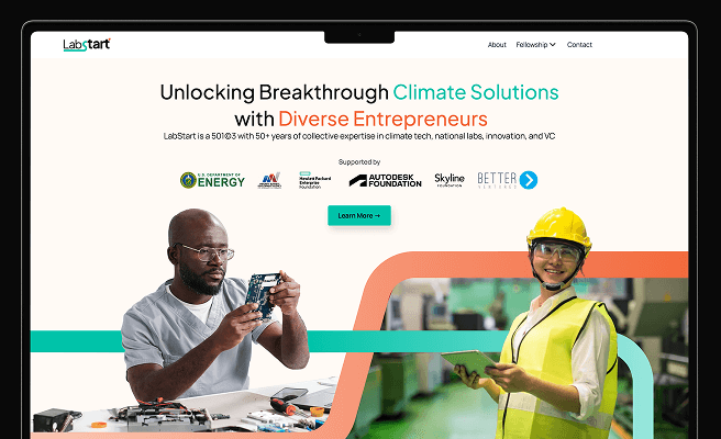
<p>A breakpoint in web design refers to specific points along the responsive design spectrum where the layout of a website changes to provide an optimal viewing experience across different devices and screen sizes. This technique ensures that content is easily readable and navigable whether viewed on a desktop, tablet, or mobile device. Breakpoints help in creating a seamless user experience by adjusting the design elements to fit the screen size, thus improving usability and accessibility.</p>
<p>Historically, breakpoints became essential with the advent of responsive web design, a concept popularized by Ethan Marcotte in 2010. Before this, designers often created separate mobile and desktop versions of websites, leading to increased maintenance and inconsistency in user experience. With breakpoints, a single design can adapt to multiple screen sizes, making it more efficient to manage and ensuring brand consistency.</p>
<p>For instance, a common breakpoint strategy might involve changing the layout at 320px for small phones, 768px for tablets, and 1024px for desktops. This ensures that the design remains functional and aesthetically pleasing across different devices. In practice, breakpoints can be adjusted based on the specific needs of the content and the target audience.</p>
<h2>Importance of Breakpoints in User Experience</h2>
<p>Breakpoints are crucial in user experience (UX) design, ensuring that users can interact with the website effectively regardless of the device they are using. By implementing breakpoints, designers can prioritize content and functionality, ensuring that the most important information is always accessible.</p>
<p>A well-implemented breakpoint strategy can significantly enhance user engagement and satisfaction. For example, in climate tech platforms where users might need to access data visualizations or interactive tools, breakpoints ensure that these elements remain functional and accessible on both large screens used in offices and smaller mobile devices used in the field.</p>
<h3>Elements of Effective Breakpoint Design</h3>
<p>Several key elements contribute to effective breakpoint design:</p>
<ul>
<li><strong>Fluid Grids:</strong> Using percentage-based grids that adjust automatically to the screen size.</li>
<li><strong>Flexible Images:</strong> Ensuring images scale properly within their containing elements to maintain visual consistency.</li>
<li><strong>Media Queries:</strong> CSS rules that apply styles conditionally based on device characteristics, such as width or height.</li>
</ul>
<p>For example, a climate tech startup might use breakpoints to ensure that their interactive map visualizations remain clear and usable on both desktop and mobile screens. By using fluid grids and media queries, they can adjust the layout to highlight key data points without overwhelming the user.</p>
<h3>Principles of Determining Breakpoints</h3>
<p>Determining effective breakpoints involves understanding the target audience and their usage patterns. Common principles include analyzing the most frequently used devices among the audience, testing the design on various screen sizes, and iterating based on user feedback.</p>
<p>The <a href="https://www.smashingmagazine.com/2011/01/guidelines-for-responsive-web-design/" style="color: #2896FF; text-decoration: underline;">Smashing Magazine</a> provides comprehensive guidelines on responsive web design, highlighting best practices for selecting breakpoints and ensuring a seamless user experience.</p>
<h2>Implementing Breakpoints in Design Projects</h2>
<p>Implementing breakpoints involves a combination of design and development skills. Tools like <a href="https://www.figma.com/" style="color: #2896FF; text-decoration: underline;">Figma</a> and <a href="https://www.sketch.com/" style="color: #2896FF; text-decoration: underline;">Sketch</a> allow designers to create responsive prototypes, while developers use CSS media queries to bring these designs to life.</p>
<p>For climate tech applications, breakpoints can be particularly useful in designing dashboards that present complex data. By adjusting the layout and scaling the elements appropriately, these dashboards can provide a clear and functional interface across different devices. Tools like <a href="https://getbootstrap.com/" style="color: #2896FF; text-decoration: underline;">Bootstrap</a> offer pre-built responsive grid systems that simplify the implementation of breakpoints.</p>
<h3>Challenges in Implementing Breakpoints</h3>
<p>While breakpoints are essential, implementing them effectively can be challenging. One of the main challenges is ensuring that the content remains consistent and accessible across different screen sizes. This often requires extensive testing and iteration.</p>
<p>Another challenge is balancing performance and design. Complex designs with multiple breakpoints can slow down the website, affecting user experience. Optimizing images, minimizing code, and using efficient CSS practices can help mitigate these issues.</p>
<h3>Overcoming Breakpoint Challenges</h3>
<p>To overcome these challenges, designers and developers should collaborate closely, using tools that facilitate prototyping and testing. Conducting user research and usability testing can provide valuable insights into how the design performs across different devices, allowing for informed adjustments.</p>
<p>For example, a climate tech company might use <a href="https://www.browserstack.com/" style="color: #2896FF; text-decoration: underline;">BrowserStack</a> to test their website on various devices and browsers, ensuring that their breakpoints deliver a consistent and high-quality user experience.</p>
<h2>Conclusion</h2>
<p>Breakpoints are a fundamental aspect of responsive web design, ensuring that digital products provide an optimal user experience across different devices. By strategically implementing breakpoints, designers can create adaptable and user-friendly interfaces that meet the needs of a diverse audience.</p>
<p>As climate tech companies continue to innovate and address environmental challenges, effective breakpoint implementation will be crucial in delivering accessible and impactful digital solutions. For those looking to enhance their responsive design strategies, resources like <a href="https://developer.mozilla.org/en-US/docs/Web/CSS/Media_Queries/Using_media_queries" style="color: #2896FF; text-decoration: underline;">Mozilla Developer Network</a> provide detailed guidance on using media queries and other responsive design techniques.</p> <p>If you’re looking for inspiration to elevate customer and user experience for enterprise-grade products, View our work with the Ministry of Health of Saudi Arabia for curating the UX of an <a href="https://www.whatifdesign.co/work/enterprise-software-for-hospitals" style="color:#2896FF; text-decoration:underline;">Asset Management Tracking Platform</a></p>
<p>Ready to get started? <a href="https://cal.com/akhilak/what-if-design?duration=30" style="color:#2896FF; text-decoration:underline;">Book a 1:1 consultation call</a> with us today.</p>

Let's scale your impact with great design.
Free consultation, no sales pitch
Thank you! Your submission has been received!
Oops! Something went wrong while submitting the form.
Let’s talk
Nothing great is built alone.
Let’s connect about your vision, our work and how we can collaborate.
Get in touch

